The winners of the data visualisation competition have been announced. The aim of the competition was to encourage participants to use well-being measurement in innovative ways to a) show how data on well-being give a more meaningful picture of the progress of societies than more traditional growth-oriented approaches, and b) to use their creativity to communicate key ideas about well-being to a broad audience.
The three prize-winners each receive a paid trip to Guadalajara in Mexico to attend the 5th OECD World Forum on the 13-15 October 2015. The winners will be awarded with a certificate of recognition during a special session at the Forum, and will also be invited to the cultural events and dinners surrounding the Forum.
The winners are:
Scattered Well-Being – Andrew Mollica
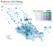
According to Andrew, his “visualization shows how varied well-being measures can be within a country and consequently how country-wide statistics can over-simplify. While it’s convenient to characterize whole populations by talking about national averages, we are often masking a lot of important complexity. This visualization attempts to make understanding this complexity approachable by allowing users to view the overall distribution of different well-being indexes as well as let them focus on a particular area
From the Judges: The interactive winner “Scattered Well-Being” impressed us with a reduced, yet rich visualization of regional differences in Well-Being in Mexico. This interactive cartogram appropriately scales regions by number of inhabitants (rather than mere geographic area, as on a choropleth map) and invites deep exploration of the underlying variables income, education, housing, health, jobs and safety across Mexico. Despite its depth of information, the application is visually reduced and snappy in performance. Overall, a great way to represent large regional data sets in a digestible and interesting form. Additionally, more complex data is effectively revealed through drilling down into data.
Seeking a Better Life – Fidel Tomet
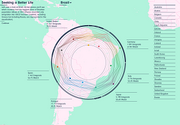
According to Fidel, his visualization “takes a look at what people say is most important to them in life and how this reflects in their choice for a new home. It thereby also raises the question how other aspects, like distance, language and immigration laws, affect the decision.”
From the Judges: The runner-up “Seeking a Better Life” provides an interesting juxtaposition of two data sets: what people say is most important to them in life (based on OECD Better Life Index responses) and how this reflects in their choice for a new home (based on data from the International Migration Database). The tool is slickly designed and based on an interesting proposition. On the flip side, the degree of detail is overwhelming at times and it is hard to see the “big picture”.
Access to Higher Education is Not Equal – Alice Feng
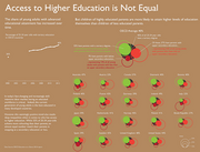
According to Alice, the concept she is trying to show is, “that although young adults in developed countries have generally become increasingly well-educated over time, when we take a closer look at the family backgrounds of those young adults, we see that children of less educated parents are under-represented relative to children of highly educated parents. Indeed, most college students come from already privileged backgrounds; children of parents with at most a secondary education are much less likely to enroll in higher education. Since higher levels of education are linked with greater earnings and better economic outcomes, this situation perpetuates inequality.”
From the Judges: The infographic “Access to Higher Education is Not Equal” provides interesting new insights into the question how far your education level depends on the one of your parents. The visual solution has ample character and invites exploration and comparison across countries. The succinct but informative text provides helpful background information and explanation for the observed data. The graphic presents a great example of how exploration and explanation can go hand in hand with a unique visual.
To find out more about the competition, click here!
–
–
–